Your brand bible, as data a script can read
You're in the graphic design studio. PromptDojo is a practice workspace, not an image generator — you will not make pictures in this browser. What you're doing this lesson: turn Halfmoon's brand board into a one-page design kit a computer can reuse — colors, type, motifs, and the never list. You do not need Midjourney flags or the prompting lesson to start.
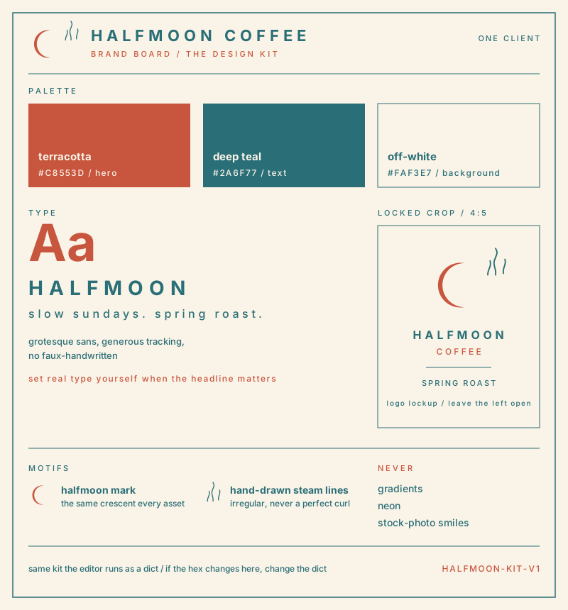
This is Halfmoon Coffee — the kit this lesson runs. Palette, type, motifs, the never list. Look at the board first.
Every brand you've ever worked on has a bible: the 40-page PDF with the logo clear-space diagrams, the Pantone chips, the typographic scale, the moodboard of what the brand is and — usually on one passive-aggressive page near the back — what it is not. You fought for every page of it.
An image model has read none of it. It can't. The PDF sits in a shared drive; the model sits in an API. Every time you type a prompt from memory, you are re-deriving the brand bible by hand, and on the fourteenth asset of a long Thursday you will forget the "no neon" rule. The client will not.
The fix is the design kit: the promptable core of the brand bible, written as a short list a script can read. The board above is the kit a designer reads. The same kit, as data:
- Palette — named colors with hex values and roles. A hex is the six-character color code (
#C8553D). Names go into prompts ("terracotta and deep teal"); hex values feed the later QA checks, where a script measures whether the renders actually stayed in gamut. - Type — the typographic voice, phrased as instructions. You'll mostly set real type yourself, but when a render includes lettering, this keeps it from coming back faux-handwritten.
- Motifs — the recurring visual furniture that makes an asset recognizably this brand: the halfmoon mark, the steam lines. Motifs are what let asset #37 sit next to asset #2 in a feed and read as siblings.
- Banned — the "never" page, promoted from passive-aggressive PDF appendix to first-class data. Next step is all about it.
brand: Halfmoon Coffee
palette:
  terracotta  #C8553D  hero
  deep teal   #2A6F77  text
  off-white   #FAF3E7  background
type: grotesque sans, generous tracking, no faux-handwritten
motifs: halfmoon mark, hand-drawn steam lines
banned: gradients, neon, stock-photo smiles
If a swatch says #C8553D, the kit says #C8553D. That sameness is the whole point.
Why a list beats a paragraph
You could paste brand notes as a paragraph into every prompt. A structured kit wins for the same reason specs beat vibes:
- It compiles. The palette names drop into any prompt, in any tool dialect, spelled identically every time.
- It validates. A script can check that every hex parses, that
bannedisn't empty, that a text color actually clears contrast on the background — before a single credit is spent. - It versions.
halfmoon-kit-v3in the client folder, dated, comparable. When the client rebrands from teal to sage, you change one field and every future prompt follows. The PDF requires a human to remember; the kit doesn't.
One kit per client, built once, feeding every prompt on the retainer. And the brand doesn't stop at images — later this lesson the same move covers the screens in the brief: design tokens, the kit's interface wing, with color roles and type and spacing scales a script can audit the same way. That's the whole trick of this lesson.